Every now and then, the tools we use to make a project clearer end up doing the opposite.
The intention is usually good. You want to avoid misunderstandings, centralize information, reassure the client, keep track of requests, and stop spending twenty minutes trying to find “that thing they sent somewhere last week.”
So you add a Notion page. Then a project board. Then a shared document. Then a Slack channel. Then a form. Then a file called “Final client feedback,” which will, inevitably, be followed two days later by “Final client feedback V2 actually final.”
The problem is not the tool itself.
The problem is that we often try to solve a lack of structure by creating one more place for the mess to live.
A client does not need to see the whole project.
They need to understand where things stand.
They do not need access to your internal tasks, your rough notes, your technical doubts, your drafts, or the small private conversations you have with yourself when a “quick change” turns out to contain six hidden decisions.
They need to know what is moving forward, what needs their input, what has been delivered, what needs approval, and how to send a new request without it disappearing into an email thread that should probably have been retired three weeks ago.
That distinction matters.
A lot of freelancers end up sharing either too little or far too much.
Share too little, and the client gets nervous. They do not know what is happening, so they follow up. They ask for updates. They repeat a request that was already handled. Or they send a message on Friday at 5:43 p.m. asking whether “everything is still good for Monday.”
Share too much, and the client lands inside a workspace that was built for production, not collaboration. They see statuses, properties, filters, views, and labels that only make sense to the person who built them. They do not know where to click. They do not know what matters. So they go back to the simplest available option: sending another message.
At that point, the client portal exists technically, but not practically.
It is a bit like installing a very nice mailbox in front of a house, then continuing to receive every letter through the kitchen window because nobody ever explained where the entrance was.
I have seen this problem often in service projects, especially with independent workers.
Not because they are careless. Usually, it is the opposite. They want to do things properly. They want to be transparent, responsive, professional. They want the client to feel that the project is under control.
But in trying to show everything, they sometimes end up showing the construction site instead of the progress.
A construction site is useful to the person building the house. Not necessarily to the person waiting to move in.
That is where the idea for Freelancer Client Portal OS came from.
Not from a desire to make “yet another Notion template.” There are already plenty of those, and some of them are very pretty.
The real problem was more ordinary, and therefore more interesting: how do you give freelancers a simple structure for managing client work without turning the client into an unpaid project manager?
The answer was to separate two spaces.
On one side, a private workspace for the freelancer. That is where the real work happens: tasks, requests, feedback, scope changes, deliverables, decisions, resources, handover notes. It is the back office. It needs to be clear, but it does not need to be staged for the client.
On the other side, a client portal. Simpler, calmer, easier to scan. A place where the client can see the project status, the items that need their attention, the deliverables waiting for approval, and the right links for sending a request, feedback, or a scope change.
That separation is not cosmetic. It is functional.
A client should not have to understand your system in order to work with you. They should simply be able to find what they need when they need it.
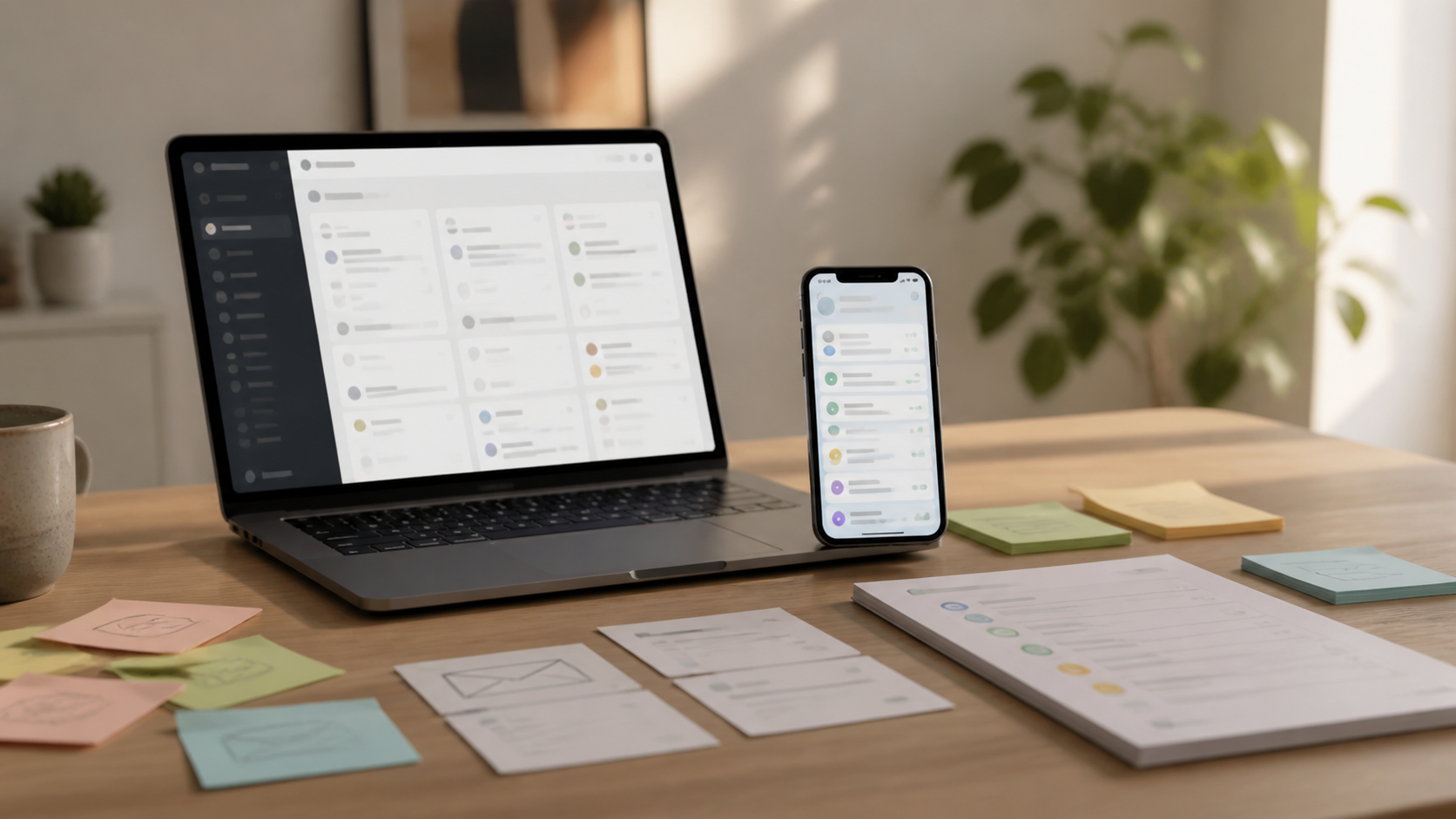
This is also why the mobile version became so important.
On paper, many workspaces seem perfectly usable. On a large screen, with Notion open, a coffee next to the keyboard, and enough patience to browse through a database table, everything can look reasonably logical.
Then you open the same thing on a phone.
And suddenly the system becomes a lot more honest.
Truncated titles, oversized views, secondary properties taking up all the space, important information buried under three unnecessary blocks: mobile quickly reveals whether a system is genuinely simple or merely comfortable on a large screen.
A client will not always check a portal in ideal conditions. They may be on a train, between meetings, standing in their kitchen, or just trying to quickly see what they need to approve before moving on with their day.
If the important information is not easy to find, they will not search for long.
They will send a message.
And the system will have failed, even if it was technically well built.
So the product had to stay deliberately restrained.
Not because minimalism is fashionable, but because a client portal has one main job: reduce friction.
That means some things have to be left out.
No impressive dashboard that flatters the freelancer but overwhelms the client. No extra views just to make the template feel bigger. No unrealistic promise like “set up in ten minutes” when the real setup depends on the project, the client, the forms, and the sharing rules.
A good system should not only be useful.
It should be honest about what it requires.
That became even clearer during testing.
When I rebuilt the product in a fresh Notion workspace, the way a buyer would, small issues became obvious. Some reusable pages existed, but were not visible enough for a beginner. Some instructions assumed the user already knew where Notion was hiding certain pages. Some wording still reflected an older version of the system.
None of this was catastrophic.
But it was exactly the kind of friction that turns a good system into an annoying product.
That test was a useful reminder: a template is not finished when it works for the person who built it. It starts to become finished when someone else can understand what to do without guessing the intention behind every page.
That is why the product now includes a clearer starting path, direct links to the pages that need to be duplicated, sharing documentation, a demo project, public forms, and a cleaner relationship between the internal project workspace and the client-facing portal.
The goal is not to replace the freelancer’s judgment.
No template can do that, and the ones that claim otherwise are mostly selling decoration.
The goal is to remove the repetitive structural decisions that should not have to be rebuilt from scratch for every new client.
Where do requests go? Where should feedback live? How do you separate a bug, a small request, and a scope change? What can the client see? What must remain private? Where do deliverables belong? How do you prepare the end of a project without digging through three months of scattered messages?
These questions look small.
They are not.
When they are not answered, they come back as follow-ups, forgotten requests, unclear approvals, missing context, and conversations that begin with “I think we talked about this, but I can’t remember where.”
A useful system does not make the work magical.
It simply stops the same kind of disorder from returning under a different client name.
I also created a free Lite version for that reason.
Not everyone needs the full system right away. Some freelancers just want to test the idea of a client portal on a small project, see whether their clients use it, and decide whether this way of working fits how they deliver.
The Lite version is intentionally limited: one client-facing portal page, a simple structure, no full database architecture, no public forms, no reusable blueprint system.
It exists so people can feel the workflow before installing the complete system.
It is an entry point, not a fake “free full version” dressed up as a gift.
The full product is built for freelancers who want a reusable client delivery system: create a client, create a project, prepare the private workspace, prepare the client portal, test the forms, and share only what the client needs to see.
Nothing revolutionary, at least not in the dramatic sense of the word.
But many good systems are not revolutionary.
They are just clear enough to stop the work from scattering.
A client portal will not make a bad project good. It will not fix a vague offer, a missing scope, or a client relationship that is already complicated. It will not replace a difficult conversation, a necessary approval, or a decision nobody wants to make.
But it can prevent a decent project from becoming painful simply because the information lives everywhere at once.
It can give the client one obvious place to look.
It can give the freelancer a private place to work without exposing all the normal mess of production.
And sometimes, that is exactly what is needed.
Not more tools. Not more messages. Not more files called “final V3.”
Just a clear separation between what is being built, what the client needs to see, and what actually needs action.
It is less spectacular than a promise of total automation.
But it is usually much more useful.
Try the free Lite version first to see whether this workflow fits the way you manage client projects.
If you want the full system with a private project workspace, reusable client portal, public forms, mobile view, and setup guides, you can upgrade to Freelancer Client Portal OS.
Paid Version
Gumroad:
https://7030042560691.gumroad.com/l/freelancer-client-portal-os
Payhip:
https://payhip.com/b/OB5cS
Notion Marketplace:
https://app.notion.com/templates/freelancer-client-portal-os
Public Notion template page:
https://tidal-freckle-312.notion.site/Freelancer-Client-Portal-OS-3b7bac0fb63e81ae96d0e312c64fe6ec
Free Lite Version
Gumroad:
https://7030042560691.gumroad.com/l/freelancer-client-portal-os-lite
Payhip:
https://payhip.com/b/KXnZJ
Public Notion Lite page:
https://tidal-freckle-312.notion.site/Freelancer-Client-Portal-OS-Lite-3c1bac0fb63e81a89264fe943e4285ac